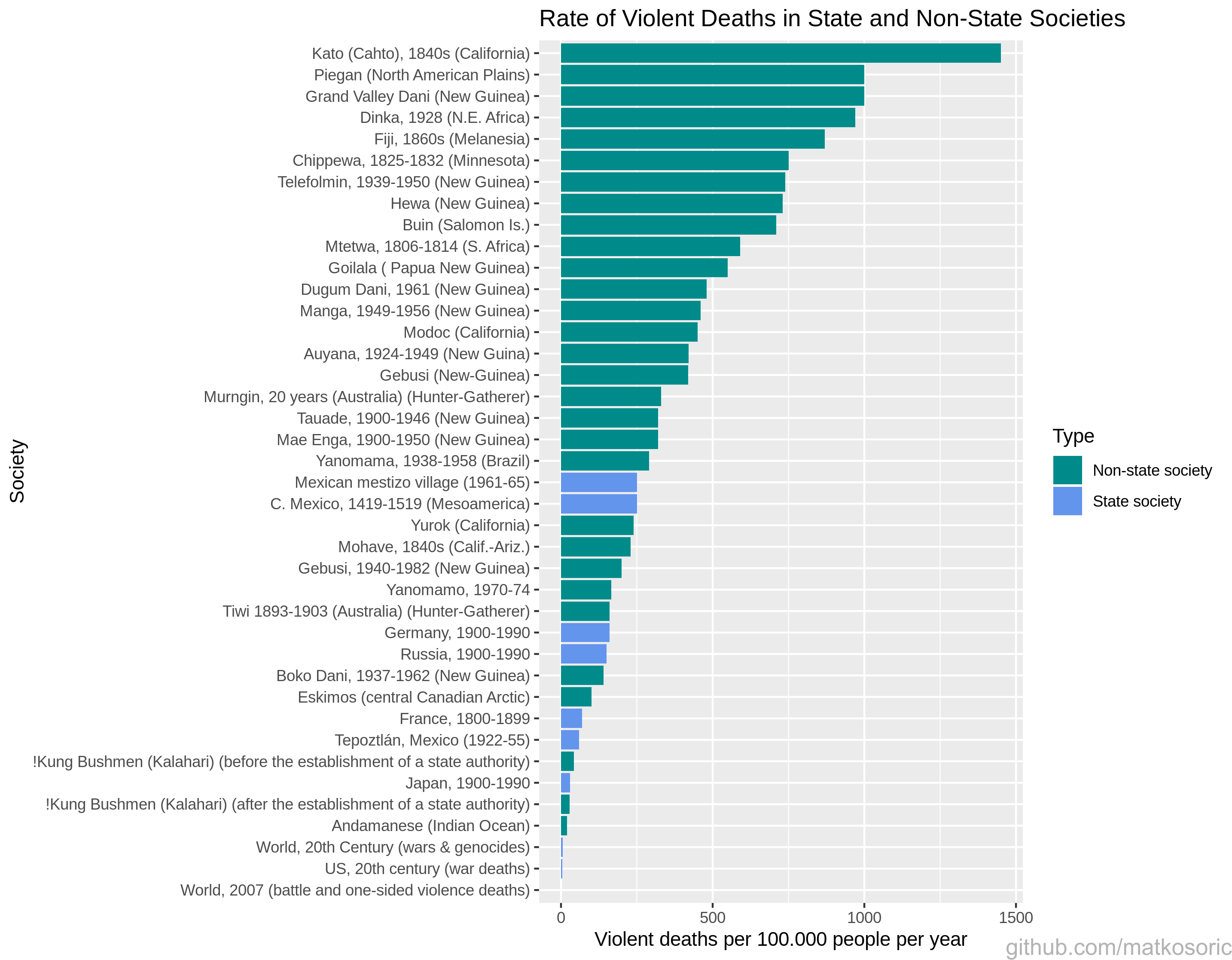
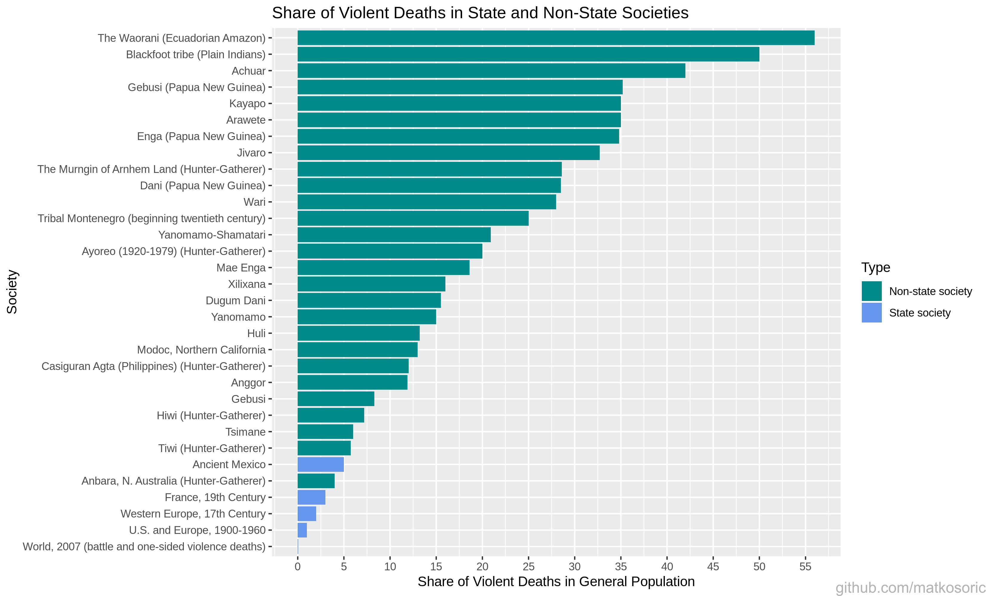
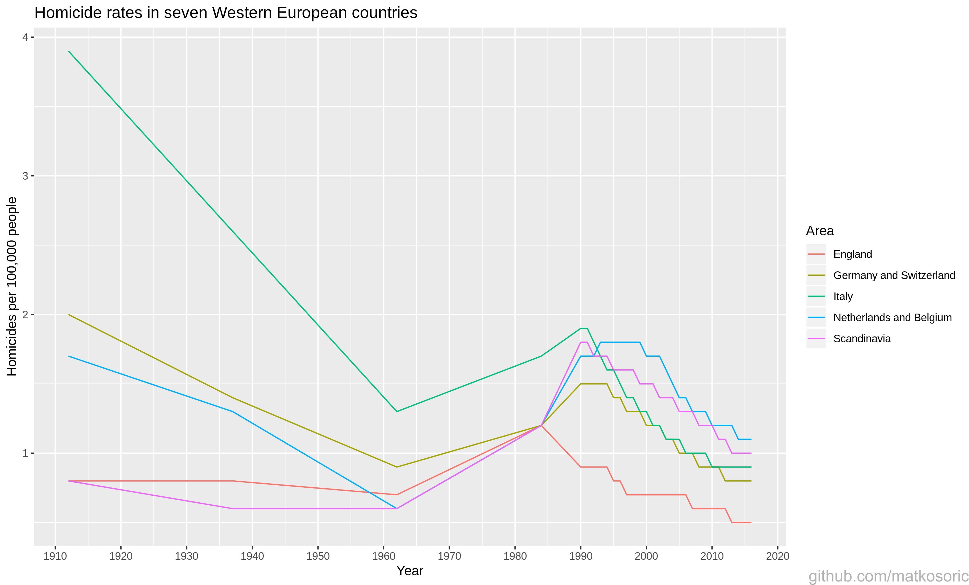
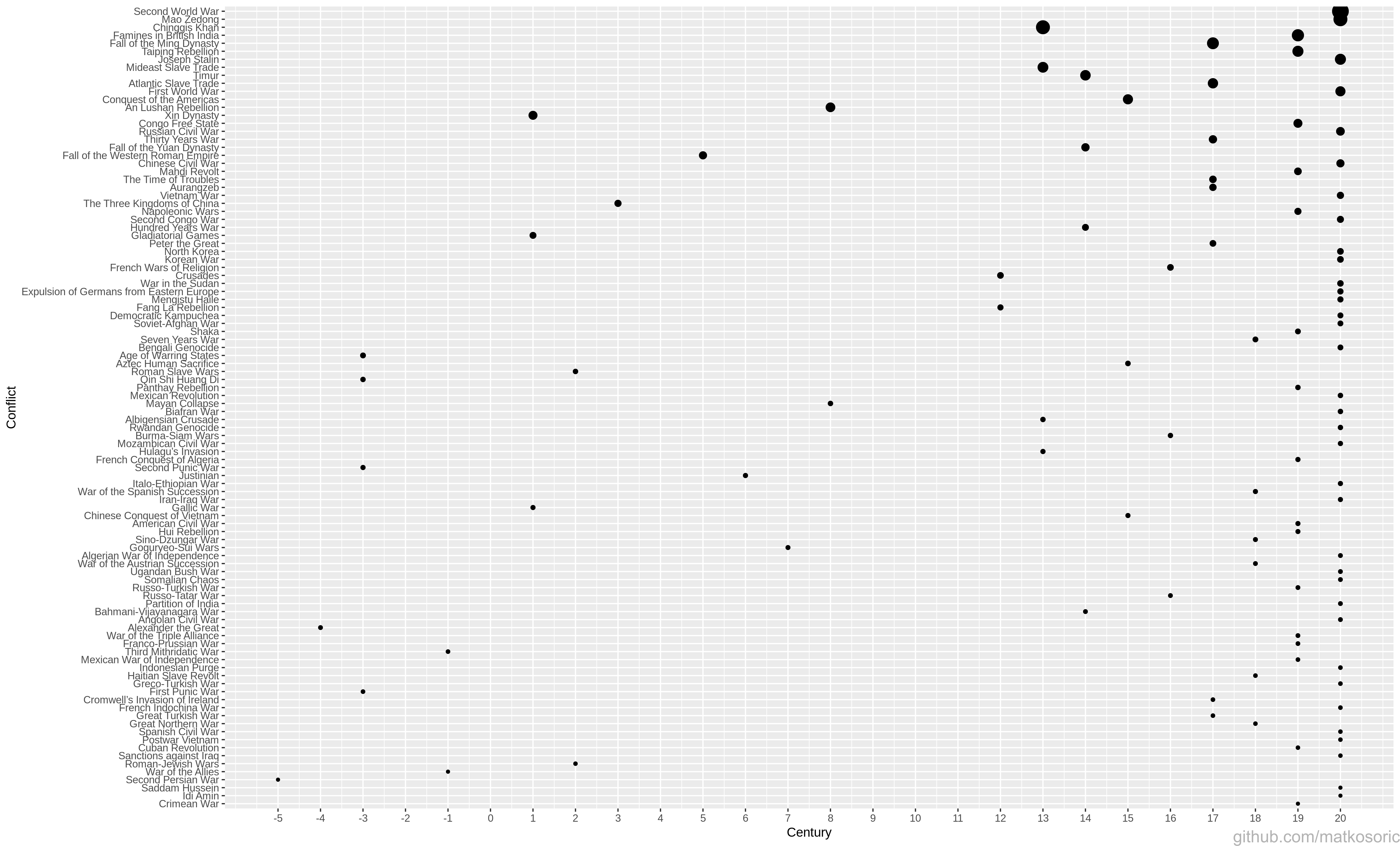
Here are several visualizations about violence rates created with R.
Several percentages in a figure about a share of violent deaths are referencing only male population; to simplify, I neglected that information.
Third figure illustrates the ‘Recivilization of the 1990s’ thesis, a period of violence decline. Pinker claims it is due to the increased incarceration: “The most effective was also the crudest: putting more men behind bars for longer stretches of time.”; and increase in the police force: “In a stroke of political genius, President Bill Clinton undercut his conservative opponents in 1994 by supporting legislation that promised to add 100,000 officers to the nation’s police forces.”, among other things.
Fourth figure is adopted to the time scale of century instead of mid year, and the conflicts are ordered.

Steven Pinker’s book: The Better Angels of Our Nature
The original Dataset
I copied the data for worldwide rate and share of violent deaths, and for rates of homicides in Western European countries from Max Roser’s articles, where he was recreating numerical data used in Steven Pinker’s figures. Data for the fourth figure is from Matthew White’s book ‘Atrocities: The 100 Deadliest Episodes in Human History’, slighty preprocessed for the century time scale, and therefore different from Pinker’s figure.
Created With


