Visualizing Geolocations in Italy using ELK stack
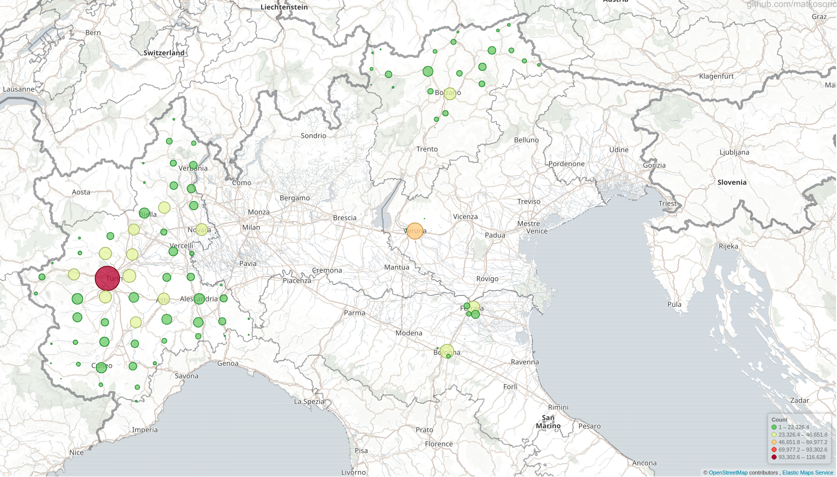
This is a demonstration of ELK stack geo-mapping capabilities.

The original Dataset
The presented data are a subset of geo points in a zip file for Europe (https://s3.amazonaws.com/data.openaddresses.io/openaddr-collected-europe.zip) available through the OpenAddresses project. I used only a couple of files related to Italy (ferrara.csv, bologna.csv, statewide.csv, etc.). Circle size and color are not related to any other features in a dataset; they simply indicate a quantity of points in a certain area.
Created With
- ElasticSearch - ElasticSearch NoSQL engine
- Kibana - Kibana visualization tool
- Logstash - Logstash ingestion tool
Visual Exploration of Croatian Literature Translations
This is a demonstration of ELK stack’s visualization capabilities. First figure is a smoothened area chart of translations through years, spiking in 2008, just before the economic crisis kicked in. Second visualization is a donut chart of translated authors, with Ivo Andrić being the most translated author (14.71%). Third image represents a bar chart of top Croatian literature translation publishers. Fourth figure is a donut chart of translations by language. German language dominates with 21.15%, followed by English (11.09%), Slovakian (10.62%), and Slovenian (9.04%). Figure five is identical to the previous figure, with added tabular info. Sixth figure represents an area figure of the number of translations grouped by country. Germany leads with over 300 published items. Seventh visualization is a pie chart of the most commonly translated titles. First place is taken by “Na Drini ćuprija” (9.1%), written by Ivo Andrić.
Figures from Steven Pinker’s book The Better Angels of Our Nature
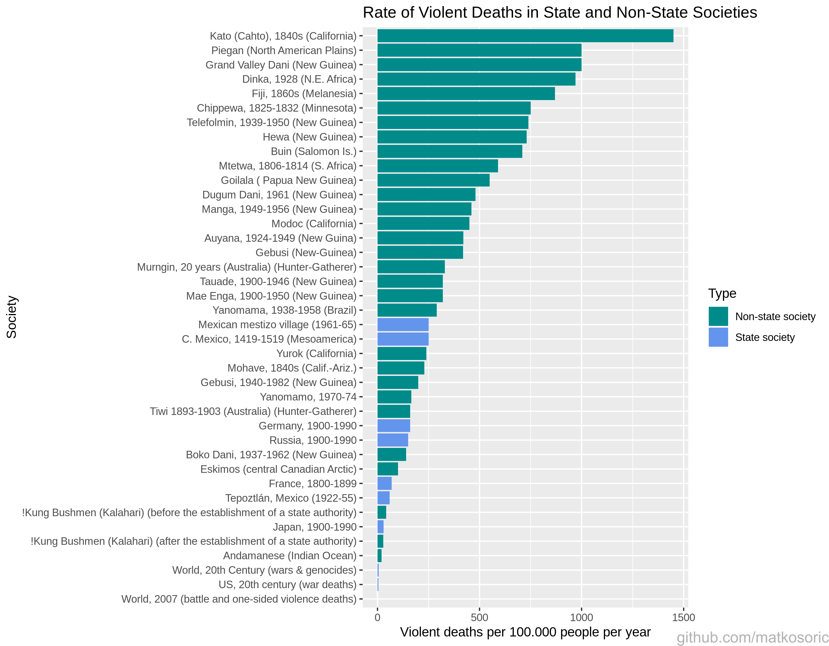
Here are several visualizations about violence rates created with R.
Several percentages in a figure about a share of violent deaths are referencing only male population; to simplify, I neglected that information.
Third figure illustrates the ‘Recivilization of the 1990s’ thesis, a period of violence decline. Pinker claims it is due to the increased incarceration: “The most effective was also the crudest: putting more men behind bars for longer stretches of time.”; and increase in the police force: “In a stroke of political genius, President Bill Clinton undercut his conservative opponents in 1994 by supporting legislation that promised to add 100,000 officers to the nation’s police forces.”, among other things.
Fourth figure is adopted to the time scale of century instead of mid year, and the conflicts are ordered.

Steven Pinker’s book: The Better Angels of Our Nature
Croatian Language Dataset
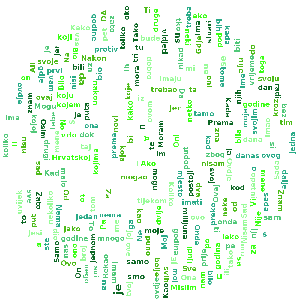
This is a dataset of sentences in Croatian language for anyone interested in Natural Language Processing. The dataset is Spark’s dataframe in a snappy compressed ORC format. Most of the sentences are from the Croatian Wikipedia dump and OpenSubtitles project. There are still entries that do not belong here, whether in a form of misspelled or grammatically incorrect sentences, logs, different languages, or weird tags. However, those should be minimal. The goal of this project was to create a reusable dataset with standardised use of Croatian language for various purposes.
Size
- 14.7 million entries
- 840 mb uncompressed size
- 460 mb snappy compressed ORC

Netflix Recommendation Model

Netflix prize was an open competition for the best collaborative filtering algorithm, which started in 2006. BellKor’s Pragmatic Chaos team from AT&T Labs won the prize back in 2009. This Spark application will use Spark’s 2.4 built-in ALS algorithm to create a recommendation model for the data set from the competition.
Link to PhD thesis entry
My philosophy PhD thesis in national bibliographic catalog.
